Okay, things are looking good for the posting of weekend cheapness.
Let's finish this little series, since we started it. Let's be clear, the choices are based on my aesthetic appreciation of the flyer -- It's not necessarily my favorite music.
--------------------------------------------------------------
JULY
I liked the minimalism of Pretty & Nice's flyer. The gentle colors, some winged ponies, and the general compostion.
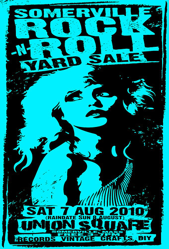
AUGUST
There was this flyer has something to enjoy and think about, but this slightly distorted image of Debbie Harry is from the era when she was probably the sexiest woman on the planet.
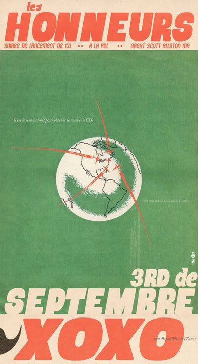
SEPTEMBER
I really wanted to choose the old-comic vibe, but the old-travel-poster vibe was cooler.
Thursday, January 06, 2011
Faves 2010: Flyers I Posted, Part 3
Posted by
rob v
at
1/06/2011 11:30:00 PM
![]()
![]()
Subscribe to:
Post Comments (Atom)


No comments:
Post a Comment